Case study
How We Built a Client Reporting Dashboard

Monitoring performance across 30 or more client accounts inside a single client reporting dashboard sounds manageable until the team is actually doing it. Pulling Google Ads data, cross-referencing Local Services Ads, and then trying to see which campaigns are actually generating real, qualified leads requires moving between platforms constantly. When the volume of accounts grows, that manual reconciliation compounds.

The agency in this build runs paid campaigns across a large book of clients, connecting Google Ads and Local Services Ads performance to actual lead outcomes. Their internal team needed a single place to see not just ad metrics but whether those ads were producing leads, and more specifically, whether those leads were good ones. They were also responsible for demonstrating that ROI to their clients and using the same data internally to evaluate and improve campaigns. With 30-plus accounts to monitor, the problem was not a lack of data. It was the absence of a single, connected view that made the data usable without manual effort each time someone needed to check in.
Why Standard Dashboard Software Could Not Do the Job
The obvious path would have been a tool like Looker Studio. It connects to Google Ads, it handles reporting, and it is free. For a single account or a handful of clients, it works. At 30-plus accounts, it starts to show its limits.
Query latency in Looker Studio scales with data volume. When a team is loading large datasets across dozens of clients, the dashboard becomes slow enough to interrupt the workflow it is supposed to support. That is a real cost in senior time: account managers and specialists waiting on page loads rather than acting on the data they are trying to read.
Beyond speed, Looker Studio and most off-the-shelf dashboard platforms constrain what can be built inside them. Custom UI elements, conditional logic, and alert flags that fire based on specific business rules are either impossible or require workarounds that introduce their own fragility. The agency needed functionality that no existing dashboard tool was going to provide out of the box.
The Client Reporting Dashboard
Matz Analytics built a custom web application dashboard, hosted as a standalone website, that connects directly to the agency’s data sources across Google Ads, Local Services Ads, and their AI-scored lead data.
The direct connection to the data sources was the first design decision. Rather than routing queries through a third-party visualization layer, the web app pulls from the underlying data directly. That eliminates the latency problem entirely. At 30-plus accounts, the dashboard loads and responds the way a purpose-built tool should.
The second layer was the lead data integration. The dashboard does not just show ad performance metrics. It connects campaign data to actual lead outcomes, including leads scored by AI for quality. An account manager looking at a client’s dashboard can see not only how many leads came in but how many of those leads were qualified according to the scoring model. That connection between ad spend and real business output is what makes the ROI visible, both for internal campaign decisions and for client-facing reporting.
The build also included custom UI filters that allow the team to slice the data across clients, campaigns, and time periods in ways that a templated tool would not support. Those filters are part of the interface itself, not a workaround bolted on after the fact.
This work sits across two of the AI systems Matz Analytics builds: Custom AI Lead Scoring, which powers the qualified lead layer inside the dashboard, and Custom AI Agentic Solutions, which covers the bespoke web application itself. The dashboard is not a configured SaaS product. It is software built to the agency’s specific data model and workflow.
The Alert Layer
The part of the build that addresses the monitoring problem most directly is the automated flag system. The dashboard includes performance alert flags that trigger when any tracked metric, leads generated being the primary one, drops below a defined threshold over the last 30 days relative to the prior 30-day period.
That logic sounds simple, but it represents a meaningful shift in how the team interacts with the data. Without it, catching a performance drop requires someone to open the dashboard, look at the right client, pull the right date range, and notice the change. With 30-plus accounts, that review either happens on a scheduled basis and creates recurring manual work, or it happens reactively after a client has already noticed a problem.
The flags invert that. The system checks the comparison automatically and surfaces the accounts that need attention. The team does not have to go looking for problems; the problems come to them. That is the Automated Reporting and Performance Alerts system in practice: alerts that catch issues before the client does.
The unexpected detail from this build is where the alert threshold logic ended up. The 30-day rolling comparison was the right frame, but calibrating what counts as a meaningful drop required working through the agency’s actual client data rather than applying a generic percentage. Some clients run campaigns with natural seasonal variation; others have stable enough lead volume that any drop is a signal. The threshold configuration ended up being client-specific, which made the flag system more precise but also more work to set up correctly. That specificity is what makes the alerts useful rather than noisy.
What This Removes From the Team’s Plate
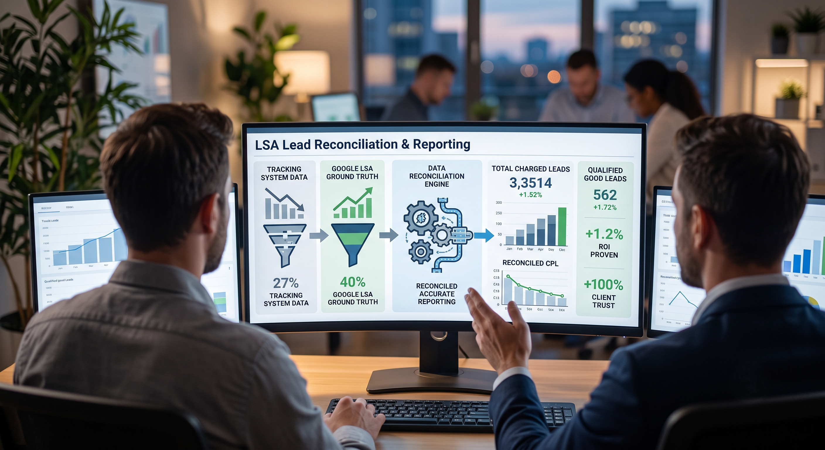
There is no completed outcome to report yet in terms of hours reclaimed over time. The dashboard is built and connected. What it removes from the team is the recurring manual work of cross-platform data reconciliation: pulling Google Ads performance, pulling Local Services Ads data, matching that against lead records, applying quality filters by hand, and then doing that review across 30-plus accounts often enough to catch problems before they become client conversations.
Each of those steps was previously a manual task. The web app now handles the data connection, the lead quality layer surfaces AI scoring directly in the interface, and the alert flags replace the manual review cycle for performance drops. The team opens one dashboard and sees what needs attention.
For any agency running paid campaigns at scale across multiple clients, the accumulation of manual data work is usually invisible until it is not. The hours do not announce themselves. They show up in senior time spent on tasks that do not require senior judgment, and in problems caught late because no one had time to look. Building the infrastructure that makes the data visible and self-monitoring is the work that takes that cost off the team.
If a team is still manually pulling platform data and reconciling lead outcomes across a large client book every week, that is exactly the kind of operational work a purpose-built AI system takes off their plate.